Show the code
#load required packages
library(tidyverse)
library(corrplot)
library(fmsb)The objective of this practical is to guide you through the process of using data for recruitment purposes. It is crucial to note that before diving into data analysis, you should have already completed the necessary steps such as cleaning your data and identifying relevant KPIs. You should also ensure you understand how your data was collected. Analyzing data that is of unknown validity and reliability is not recommended. If you are unsure about the required steps, I recommend revisiting the previous sessions.
During this practical, you may encounter some unfamiliar code. However, there’s no need to worry too much about it. With more practice, the code will gradually become more understandable.
#load required packages
library(tidyverse)
library(corrplot)
library(fmsb)In this practical we will use the dataset you used for case study 3. We will load this using:
# Set the filepath where the CSV file is located
CSVDirectory <- "https://strath-my.sharepoint.com/:x:/g/personal/xanne_janssen_strath_ac_uk/EeAppJNx4HxElLeIkW62DvIBCpp3RGRsYONPXLcM4gOV3A?download=1"

CricketDataDF <- read.csv(CSVDirectory)The dataset you’ve been given is pretty clean but lets run a quick check to ensure all our data has been imported correctly before we start analysing some of the data.
#check structure
str(CricketDataDF)
'data.frame': 17998 obs. of 15 variables:
$ Innings.Player: chr "A Beggs" "A Beggs" "A Beggs" "A Bosch" ...
$ Runs_Scored : int 0 0 NA NA NA 6 11 17 5 20 ...
$ Minutes_Batted: int 1 1 NA NA NA NA NA 42 0 59 ...
$ Batted_Flag : int 1 1 0 0 0 1 1 1 1 1 ...
$ Not_Out_Flag : int 0 1 0 0 0 0 0 0 0 0 ...
$ Balls_Faced : int 2 0 NA NA NA 8 28 37 22 45 ...
$ Boundary_Fours: int 0 0 NA NA NA 0 0 3 0 1 ...
$ Boundary_Sixes: int 0 0 NA NA NA 0 0 0 0 0 ...
$ Innings_Number: int 1 2 2 1 2 1 2 2 2 2 ...
$ Opposition : chr "v India Women" "v SA Women" "v SA Women" "v AUS Women" ...
$ Ground : chr "Potchefstroom (Uni)" "Potchefstroom" "Potchefstroom (Uni)" "Canberra" ...
$ Date : chr "2017-05-07" "2017-05-11" "2017-05-19" "2016-11-18" ...
$ Country : chr "Ireland Women" "Ireland Women" "Ireland Women" "South Africa Women" ...
$ X50.s : int 0 0 0 0 0 0 0 0 0 0 ...
$ X100.s : int 0 0 0 0 0 0 0 0 0 0 ...From the above we can see that our dates have reversed to a character class. Let’s quickly change that back to date. We would also like to change the country to a factor variable, this will allow us to compare countries later.
#format Date variable to date
CricketDataDF <- CricketDataDF %>%
  mutate(Date=as.Date(Date))

#format Country to factor
CricketDataDF <- CricketDataDF %>%
mutate(Country=as.factor(Country))Now we have loaded in and cleaned our data it is time to start our analysis. The first thing we want to do is think about our performance outcomes, determinants and KPIs. As the dataset we have in front of us is quite high level, we will not be able to go into very detailed KPIs such as biomechanical related KPIs. However, we can examine this data to discover players we would like to recruit to our team. Some of the most commonly used KPIs in cricket (for batting) are:
Runs scored
Average runs scored
Batting strike rate <- \((Total Runs/ Total balls faced) * 100\)
Batting average <- \((Total Runs / (Innings Played - Total Not Outs))\) [^ra-in-r-2]
Not out rate <- \((Not Outs / Innings Played) * 100\)
Percentage of boundaries <- \((((Boundaries4*4)+(Boundaries6*6))/Total Runs)*100\)
Let’s start with examining runs scored. We are interested in the top performers for runs scored. To find out who they are we will sort our data based on the Runs_Scored variable, and list the top 5.
# Sort data by runs scored and print the top 5.
CricketDataDF %>%
  arrange(desc(Runs_Scored)) %>%
  head(5)
Innings.Player Runs_Scored Minutes_Batted Batted_Flag Not_Out_Flag
1 AC Kerr 232 195 1 1
2 DB Sharma 188 195 1 0
3 AC Jayangani 178 NA 1 1
4 H Kaur 171 143 1 1
5 SR Taylor 171 194 1 0
Balls_Faced Boundary_Fours Boundary_Sixes Innings_Number Opposition
1 145 31 2 1 v Ire Women
2 160 27 2 1 v Ire Women
3 143 22 6 1 v AUS Women
4 115 20 7 1 v AUS Women
5 137 18 2 1 v SL Women
Ground Date Country X50.s X100.s
1 Dublin 2018-06-13 New Zealand Women 0 1
2 Potchefstroom 2017-05-15 India Women 0 1
3 Bristol 2017-06-29 Sri Lanka Women 0 1
4 Derby 2017-07-20 India Women 0 1
5 Mumbai 2013-02-03 West Indies Women 0 1We can see that Kerr from New Zealand hit the highest number of runs during a match against Ireland. She was followed by Sharma and Jayangani from India and Sri Lanka, respectively.
Just looking at the number of runs could be problematic though. Players who face more balls and play for longer will most likely hit more runs, lets see if this is true by examining the correlation between Runs_Scored, Balls_Faced, and Minutes_Batted
CorrelationMatrix <-cor(CricketDataDF[,c(2,3,6)],use="complete.obs")
CorrelationMatrix
Runs_Scored Minutes_Batted Balls_Faced
Runs_Scored 1.0000000 0.8832061 0.8903083
Minutes_Batted 0.8832061 1.0000000 0.9704019
Balls_Faced 0.8903083 0.9704019 1.0000000In the code above we use the correlation coefficient to show the the strength of the correlation, there are other ways to visualise this (e.g. using color). If you want to explore those enter ?corrplot in your console. This will give you information about the function you want to use.
The results above show us that there is a strong correlation between Runs_Scored and Balls_Faced, as well as Runs_Scored and Minutes_Batted this something we need to take into account and further on in this practical we will make sure we control for this using the Batting Strike Rate KPI.
When comparing KPIs it would be easier to have an overview of a players total number of innings and averages for each of the measures. We can create a new table with one row per athlete using group_by() and summarize() functions
The code below creates a new data table named SummaryDataDF. The data is first grouped by player using group_by(). After this the code creates sums for each player and each of the specified variables using sum() as well as the average using mean().
SummaryDataDF <- CricketDataDF %>%
  group_by(Innings.Player) %>%
  summarize(
    Runs_ScoredTotal = sum(Runs_Scored,na.rm=TRUE),
    Minutes_BattedTotal = sum(Minutes_Batted,na.rm=TRUE),
    MatchesTotal = sum(Batted_Flag, na.rm=TRUE),
    Not_Out_FlagTotal = sum(Not_Out_Flag,na.rm=TRUE),
    Balls_FacedTotal = sum(Balls_Faced,na.rm=TRUE),
    Boundary_FoursTotal =sum(Boundary_Fours,na.rm=TRUE),
    Boundary_SixesTotal =sum(Boundary_Sixes,na.rm=TRUE),
    Total_InningsTotal =sum(!is.na(Runs_Scored)),
    X501 =sum(X50.s,na.rm=TRUE),
    X1001=sum(X100.s,na.rm=TRUE),
    Runs_ScoredPerMatch = mean(Runs_Scored,na.rm=TRUE),
    Minutes_BattedPerMatch = mean(Minutes_Batted,na.rm=TRUE),
    Not_OutPerMatch = mean(Not_Out_Flag,na.rm=TRUE),
    Balls_FacedPerMatch = mean(Balls_Faced,na.rm=TRUE),
    Boundary_FoursPerMatch=mean(Boundary_Fours,na.rm=TRUE),
    Boundary_SixesPerMatch=mean(Boundary_Sixes,na.rm=TRUE),
    X50PerMatch=mean(X50.s,na.rm=TRUE),
    X100PerMatch=mean(X100.s,na.rm=TRUE),
)Now let’s look at the top performing players for runs scored again but as an average over all their matches (we will focus on those that played at least 20 matches). First we will filter SummaryDataDF so only those players with more than 19 matches are included, then we will sort the data on Runs_ScoredPerMatch and show the top 5 rows.
SummaryDataDF %>%
  filter(MatchesTotal>19)%>%
  arrange(desc(Runs_ScoredPerMatch)) %>%
  head(5)
# A tibble: 5 × 19
Innings.Player Runs_ScoredTotal Minutes_BattedTotal MatchesTotal
<chr> <int> <int> <int>
1 MM Lanning 3693 3021 80
2 S Mandhana 2025 3059 51
3 SR Taylor 4754 6266 123
4 SW Bates 4534 6170 118
5 L Wolvaardt 1871 3092 49
# ℹ 15 more variables: Not_Out_FlagTotal <int>, Balls_FacedTotal <int>,
# Boundary_FoursTotal <int>, Boundary_SixesTotal <int>,
# Total_InningsTotal <int>, X501 <int>, X1001 <int>,
# Runs_ScoredPerMatch <dbl>, Minutes_BattedPerMatch <dbl>,
# Not_OutPerMatch <dbl>, Balls_FacedPerMatch <dbl>,
# Boundary_FoursPerMatch <dbl>, Boundary_SixesPerMatch <dbl>,
# X50PerMatch <dbl>, X100PerMatch <dbl>Now let’s visualize the top 10 players based on runs scored per match
# First we wil create a new data table showing the players with the top 10 runs, making sure only those with a minimum of 19 matches are included.

Top10RunsDF <- SummaryDataDF %>%
  filter(MatchesTotal>19)%>%
  arrange(desc(Runs_ScoredPerMatch)) %>%
  slice(1:10)

# Next we use ggplot to plot a bar chart of those recording the top 10 runs.

ggplot(Top10RunsDF, aes(reorder(Innings.Player,-Runs_ScoredPerMatch),
                              y=Runs_ScoredPerMatch)) + geom_col(show.legend = FALSE) + ggtitle("Top 10 Runs")+
  geom_text(aes(label = round(Runs_ScoredPerMatch,1), vjust = -0.1))+theme(axis.text.x = element_text(angle = 60, hjust = 1),
        plot.title = element_text(hjust=0.5, colour="Black",
                                  size=20)) + labs(y="Runs Scored", x= "Player")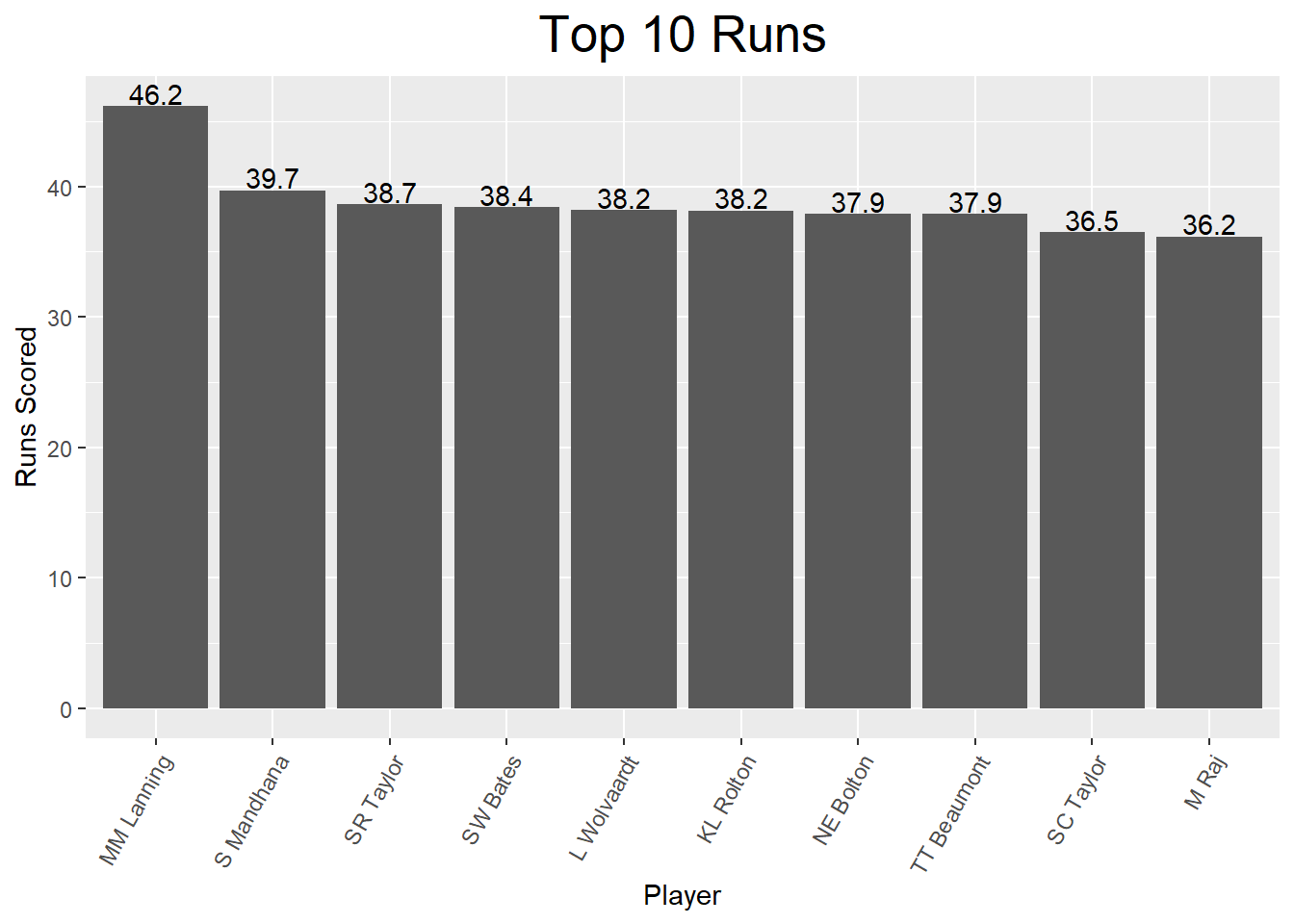
Looking at this charts we can see the top 10 players average from 36 to just over 46 runs per match. Let’s have a closer look at this as an average does not always tell us everything. We want to dive a little bit deeper into the data and understand the spread of scores across different games played (i.e. does the top performer perform consistently around 46 or is her average based on an outlier?). To do this we will first create a dataset with all the match by match data for our 10 top performing players.
# We first create a vector which includes the names of the top 10 players. We can then use this to obtain their data from the original CricketData table.
NamesTop10 <- Top10RunsDF$Innings.Player

# We will now filter the original cricket data for data of the top 10 players.
Top10RunsMatchDF <- CricketDataDF %>%
    filter(Innings.Player %in% NamesTop10)
Now we have data set with all the data included for each top 10 player we can create some box plots or a histogram to look at the spread of scores for each player.
#Create boxplots

boxp <- ggplot(Top10RunsMatchDF, aes(x=fct_reorder(Innings.Player, Runs_Scored, .desc=TRUE), y=Runs_Scored)) +
  geom_jitter(aes(colour=Innings.Player), show.legend = FALSE) +
  geom_boxplot(alpha = 0.7, outlier.colour = NA) +
  xlab("") +
  ylab("Runs Scored per Match") +
  ggtitle("Runs Scored per match by Individual Players") +
    theme(
    axis.text.x = element_text(angle = 90, hjust = 1),
    axis.text.y = element_text(),
    plot.title = element_text(hjust=0.5, colour="Black",
                                  size=20)
    )
boxp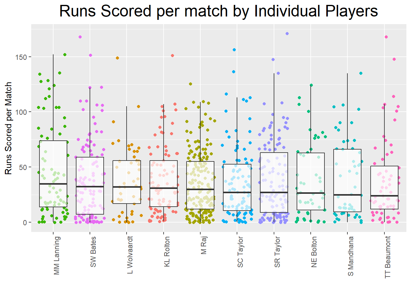
# Create histograms

ggplot(Top10RunsMatchDF, aes(Runs_Scored)) +
    geom_histogram() +
    ggtitle(paste("Histogram of Players Runs"))  +  facet_wrap(~Innings.Player)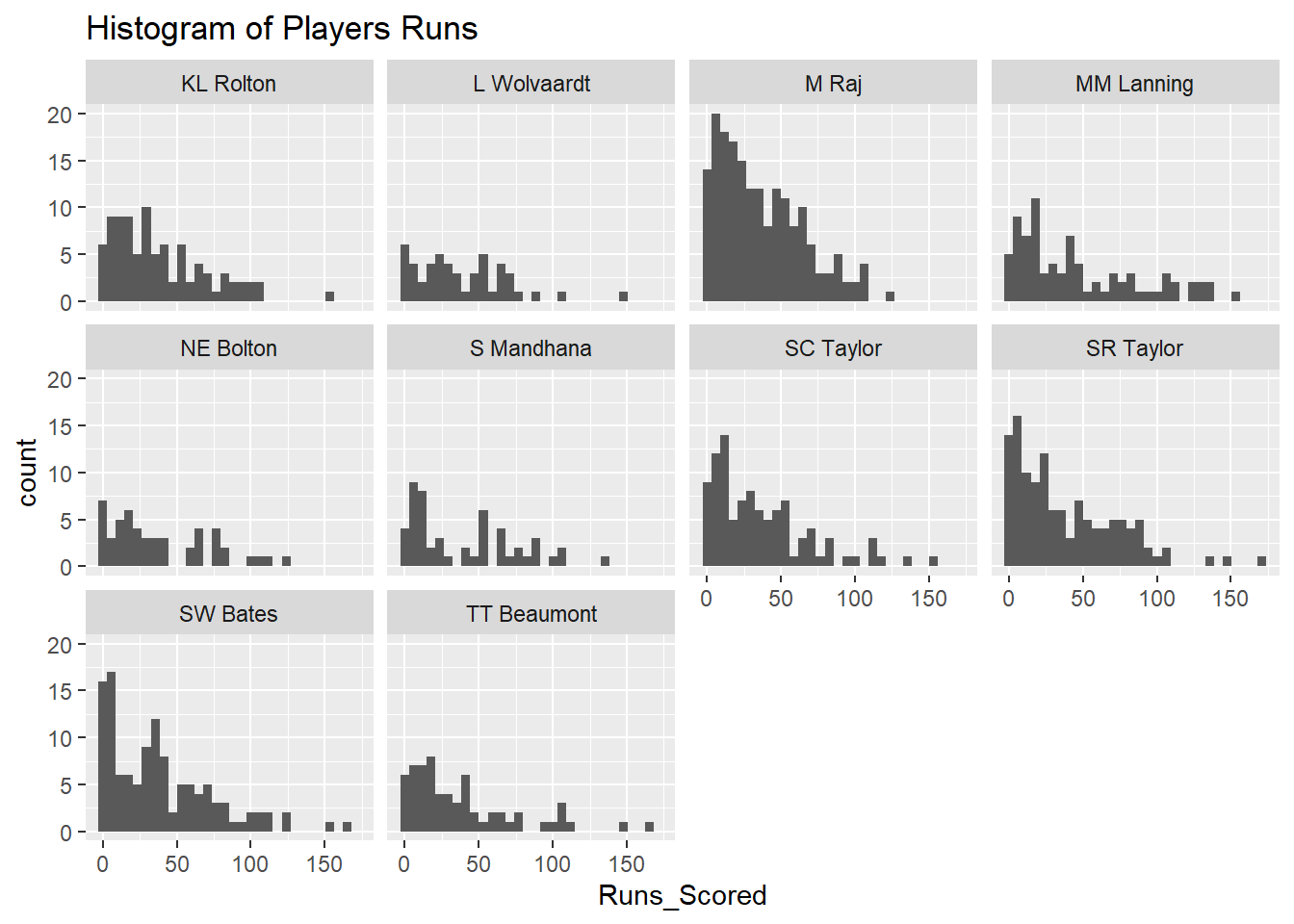
From the boxplots and the histogram we can observe that there is quite a spread in runs scored per match but this as explained earlier could be due to differences in length of play or balls faced. In the next section we will therefore create KPIs which will account for these differences.
As mentioned, we now have a bit of an idea of some of the top performing batters but all the variables we have in our table at the moment are prone to misinterpretation (e.g. as we showed previously runs made are highly dependent on balls faced). Therefore we want to calculate a few KPIs which correct for the differences in balls faced and/or are commonly used within the field of cricket.
KPIs are:
Batting strike rate <- \((Total Runs/ Total balls faced) * 100\)
Batting average <- \((Total Runs / (Innings Played - Total Not Outs))\) 1
Not out rate <- \((Not Outs / Innings Played) * 100\)
Percentage of boundaries <- \((((Boundaries4*4)+(Boundaries6*6))/Total Runs)*100\)
#calculate batting strike rate and percentage boundaries per match. Note we use is.finite to ensure we do not get an error when dividing by 0.

CricketDataDF <- CricketDataDF %>%
  mutate(
    BattingStrikeRate = ifelse(is.finite(Runs_Scored / Balls_Faced), (Runs_Scored / Balls_Faced) * 100, NA),
   PercBoundaries = ifelse(is.finite(((Boundary_Fours * 4) + (Boundary_Sixes * 6)) / Runs_Scored), (((Boundary_Fours * 4) + (Boundary_Sixes * 6)) / Runs_Scored) * 100, NA)
)#calculate the above mentioned KPIs for average data too.
SummaryDataDF <- SummaryDataDF %>%
mutate(
BattingStrikeRate = ifelse(is.finite(Runs_ScoredTotal / Balls_FacedTotal), (Runs_ScoredTotal / Balls_FacedTotal) * 100, NA),
BattingAverage = ifelse(is.finite(Runs_ScoredTotal / (Total_InningsTotal - Not_Out_FlagTotal)), (Runs_ScoredTotal / (Total_InningsTotal - Not_Out_FlagTotal)), NA),
NotOutRate = ifelse(is.finite(Not_Out_FlagTotal / Total_InningsTotal), (Not_Out_FlagTotal / Total_InningsTotal) * 100, NA),
PercBoundaries = ifelse(is.finite(((Boundary_FoursTotal * 4) + (Boundary_SixesTotal * 6)) / Runs_ScoredTotal), (((Boundary_FoursTotal * 4) + (Boundary_SixesTotal * 6)) / Runs_ScoredTotal) * 100, NA)
)Now we have created the additional KPIs measures we can have a look at visualising the data of our top 10 players for each KPI.
Top10StrikeRateDF <- SummaryDataDF %>%
  filter(MatchesTotal>19)%>%
  arrange(desc(BattingStrikeRate)) %>%
  slice(1:10)

Top10BattingAverageDF<- SummaryDataDF %>%
  filter(MatchesTotal>19)%>%
  arrange(desc(BattingAverage)) %>%
  slice(1:10)

Top10NotOutRateDF<- SummaryDataDF %>%
  filter(MatchesTotal>19)%>%
  arrange(desc(NotOutRate)) %>%
  slice(1:10)

Top10PercBoundariesDF<- SummaryDataDF %>%
  filter(MatchesTotal>19)%>%
  arrange(desc(PercBoundaries)) %>%
  slice(1:10)

print(Top10StrikeRateDF)
# A tibble: 10 × 23
Innings.Player Runs_ScoredTotal Minutes_BattedTotal MatchesTotal
<chr> <int> <int> <int>
1 A Gardner 342 119 21
2 PJ te Beest 778 311 22
3 AC Kerr 497 459 21
4 AJ Healy 1638 1121 62
5 CL Tryon 1233 1336 62
6 NR Sciver 1885 1538 58
7 MM Lanning 3693 3021 80
8 S Pandey 507 466 32
9 A Kirkire 304 309 22
10 NAJ George 622 558 40
# ℹ 19 more variables: Not_Out_FlagTotal <int>, Balls_FacedTotal <int>,
# Boundary_FoursTotal <int>, Boundary_SixesTotal <int>,
# Total_InningsTotal <int>, X501 <int>, X1001 <int>,
# Runs_ScoredPerMatch <dbl>, Minutes_BattedPerMatch <dbl>,
# Not_OutPerMatch <dbl>, Balls_FacedPerMatch <dbl>,
# Boundary_FoursPerMatch <dbl>, Boundary_SixesPerMatch <dbl>,
# X50PerMatch <dbl>, X100PerMatch <dbl>, BattingStrikeRate <dbl>, …print(Top10NotOutRateDF)# A tibble: 10 × 23
Innings.Player Runs_ScoredTotal Minutes_BattedTotal MatchesTotal
<chr> <int> <int> <int>
1 G Sultana 96 318 23
2 IT Guha 122 255 32
3 AM Dodd 155 241 20
4 I Ranaweera 156 204 40
5 MM Letsoalo 68 230 23
6 HL Colvin 180 278 27
7 Sadia Yousuf 37 299 31
8 EA Osborne 359 536 33
9 SC Selman 180 366 35
10 RM Farrell 182 228 20
# ℹ 19 more variables: Not_Out_FlagTotal <int>, Balls_FacedTotal <int>,
# Boundary_FoursTotal <int>, Boundary_SixesTotal <int>,
# Total_InningsTotal <int>, X501 <int>, X1001 <int>,
# Runs_ScoredPerMatch <dbl>, Minutes_BattedPerMatch <dbl>,
# Not_OutPerMatch <dbl>, Balls_FacedPerMatch <dbl>,
# Boundary_FoursPerMatch <dbl>, Boundary_SixesPerMatch <dbl>,
# X50PerMatch <dbl>, X100PerMatch <dbl>, BattingStrikeRate <dbl>, …print(Top10PercBoundariesDF)# A tibble: 10 × 23
Innings.Player Runs_ScoredTotal Minutes_BattedTotal MatchesTotal
<chr> <int> <int> <int>
1 A Gardner 342 119 21
2 L Lee 2602 2941 81
3 AJ Healy 1638 1121 62
4 MDT Kamini 825 1777 37
5 AC Jayangani 2625 2073 84
6 S Pandey 507 466 32
7 HK Matthews 1046 1099 42
8 CL Tryon 1233 1336 62
9 RH Priest 1694 2483 74
10 PY Lavine 548 779 24
# ℹ 19 more variables: Not_Out_FlagTotal <int>, Balls_FacedTotal <int>,
# Boundary_FoursTotal <int>, Boundary_SixesTotal <int>,
# Total_InningsTotal <int>, X501 <int>, X1001 <int>,
# Runs_ScoredPerMatch <dbl>, Minutes_BattedPerMatch <dbl>,
# Not_OutPerMatch <dbl>, Balls_FacedPerMatch <dbl>,
# Boundary_FoursPerMatch <dbl>, Boundary_SixesPerMatch <dbl>,
# X50PerMatch <dbl>, X100PerMatch <dbl>, BattingStrikeRate <dbl>, …print(Top10BattingAverageDF)# A tibble: 10 × 23
Innings.Player Runs_ScoredTotal Minutes_BattedTotal MatchesTotal
<chr> <int> <int> <int>
1 MM Lanning 3693 3021 80
2 EA Perry 3022 2370 89
3 M Raj 6618 10553 183
4 KL Rolton 3396 5542 89
5 L Wolvaardt 1871 3092 49
6 SR Taylor 4754 6266 123
7 S Mandhana 2025 3059 51
8 SC Taylor 3611 5948 99
9 SW Bates 4534 6170 118
10 BL Mooney 1053 678 31
# ℹ 19 more variables: Not_Out_FlagTotal <int>, Balls_FacedTotal <int>,
# Boundary_FoursTotal <int>, Boundary_SixesTotal <int>,
# Total_InningsTotal <int>, X501 <int>, X1001 <int>,
# Runs_ScoredPerMatch <dbl>, Minutes_BattedPerMatch <dbl>,
# Not_OutPerMatch <dbl>, Balls_FacedPerMatch <dbl>,
# Boundary_FoursPerMatch <dbl>, Boundary_SixesPerMatch <dbl>,
# X50PerMatch <dbl>, X100PerMatch <dbl>, BattingStrikeRate <dbl>, …From these tables we can see that the top 10 players differ per KPI. It is therefore important to have an understanding about which KPIs are most valuable. Another option would be to create a composite score which includes all KPIs based on specific weightings.
When deciding on top performing players we may want to compare players it is very important to understand the KPIs a player should excel in and base comparison on those. For now we continue with the KPIs created earlier and we will use BattingStrikeRate as the most important and use the top 10 players for this KPI as comparison.
# Please note this is an example of how you can compare players using radar plots. I don't expect you to be able to do this straight away.

# First we need to define the columns to normalize as we want all values to range between 0-1. We will normalise our KPIs
ColumnsToNormalize <- c("BattingStrikeRate", "BattingAverage", "NotOutRate", "PercBoundaries")

# Compute the maximum values for the specified columns. To normalise to 1 we will need to know the max value present for each variable in the full dataset, this will be listed in a vector called max_values.

SummaryDataFilteredDF <- SummaryDataDF %>%
  filter(MatchesTotal>19)
max_values <- apply(SummaryDataFilteredDF[,ColumnsToNormalize], 2, max,na.rm=TRUE)

# Note you could also specify our own max values if we knew pro values (e.g. max_values <- c(100, 7, 7, 8, 5))

# Normalize the specified columns (column values / max_values)
NormalizedColumnsDF <- sweep(SummaryDataFilteredDF[, ColumnsToNormalize], 2, max_values, "/")
colnames(NormalizedColumnsDF) <- paste('Norm', colnames(NormalizedColumnsDF), sep = '_')


# Add the normalized columns back to the filtered data frame
SummaryDataFilteredDF <- cbind(SummaryDataFilteredDF, NormalizedColumnsDF)

# Filter for specific athletes (here we filter for top 5 batting strike rate)
Top5StrikeRateDF <- SummaryDataFilteredDF %>%
  arrange(desc(BattingStrikeRate)) %>%
  slice(1:5)

#select the data for the radar chart
RadarDataDF <- Top5StrikeRateDF[,c("Norm_BattingStrikeRate", "Norm_BattingAverage", "Norm_NotOutRate", "Norm_PercBoundaries", "Innings.Player")]


RadarDataDF <- data.frame(BattingStrikeRate = c(1, 0, RadarDataDF$Norm_BattingStrikeRate),
BattingAverage = c(1, 0, RadarDataDF$Norm_BattingAverage),
NotOutRate = c(1, 0, RadarDataDF$Norm_NotOutRate),
PercBoundaries = c(1, 0, RadarDataDF$Norm_PercBoundaries),
row.names=c("max","min",RadarDataDF$Innings.Player))


create_beautiful_radarchart <- function(data, color = "#00AFBB",
                                        vlabels = colnames(data), vlcex = 0.7,
                                        caxislabels = NULL, title = NULL, ...){
  radarchart(
    data, axistype = 1,
    # Customize the polygon
    pcol = color, pfcol = scales::alpha(color, 0.2), plwd = 2, plty = 1,
    # Customize the grid
    cglcol = "grey", cglty = 1, cglwd = 0.8,
    # Customize the axis
    axislabcol = "grey",
    # Variable labels
    vlcex = vlcex, vlabels = vlabels,
    caxislabels = caxislabels, title = title, ...
  )
}

op <- par(mar = c(1, 2, 2, 2))
RadarPlot<-create_beautiful_radarchart(
  data = RadarDataDF, caxislabels = c(0, 0.25, 0.5, 0.75, 1),
  color = c("#00AFBB", "#E7B800", "green","purple", "darkred")
)

# Add an horizontal legend
legend(
  x = "topright", legend = rownames(RadarDataDF[-c(1,2),]), horiz = FALSE,
  bty = "n", pch = 20 , col = c("#00AFBB", "#E7B800", "green","purple", "darkred"),
  text.col = "black", cex = 1, pt.cex = 1.5
  )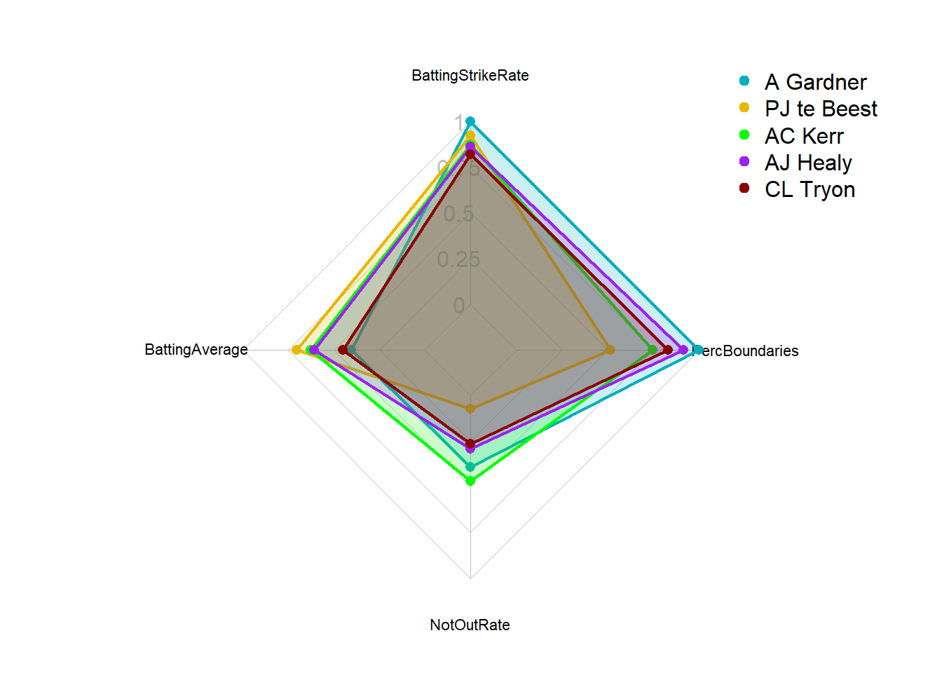
par(op)


# Print the radar chart
print(RadarPlot)NULLIn the previous example we used BattingStrikeRate as the most important variable and ranked on this. However, this means that players doing well in all others but average on BattingStrikeRate would not be picked up. If we want to include all relevant KPIs we should create a composite score based on weightings. Let’s use the previous four KPIs we determined 1) Batting strike rate; 2) Batting average; 3) Not out rate; 4) Percentage of boundaries. Now let’s say that batting strike rate is worth 40% and all others 20%. To create a composite score we should first standardise the values so they can be compared directly and then use the weightings to create a composite score (i.e. an overall players value).
We already normalised our values between 0-1 above by taking the max value and then dividing the players values by the max value but an alternative option can be used:
# get the max value
MaxBSR <- max(SummaryDataFilteredDF$BattingStrikeRate,na.rm=TRUE)
MaxBA <- max(SummaryDataFilteredDF$BattingAverage,na.rm=TRUE)
MaxNO <- max(SummaryDataFilteredDF$NotOutRate,na.rm=TRUE)
MaxPB <- max(SummaryDataFilteredDF$PercBoundaries,na.rm=TRUE)

# Normalize the specified columns (column values / max_values)
SummaryDataFilteredDF <- SummaryDataFilteredDF %>%
  mutate(Norm_BattingStrikeRate1=BattingStrikeRate/MaxBSR,
         Norm_BattingAverage1=BattingAverage/MaxBA,
         Norm_NotOutRate1=NotOutRate/MaxNO,
         Norm_PercBoundaries1=PercBoundaries/MaxPB)

# add weighted total score
SummaryDataFilteredDF <- SummaryDataFilteredDF %>%
  mutate( PlayerScore = Norm_BattingStrikeRate1*0.40+Norm_BattingAverage1*0.2+ Norm_NotOutRate1*0.2+ Norm_PercBoundaries1*0.2
           )
# Filter for specific athletes (here we filter for top 5 total score)
Top5PlayerScoreDF <- SummaryDataFilteredDF %>%
  arrange(desc(PlayerScore)) %>%
  slice(1:5)

#select the data for the radar chart
RadarData2DF <- Top5PlayerScoreDF[,c("Norm_BattingStrikeRate1", "Norm_BattingAverage1", "Norm_NotOutRate1", "Norm_PercBoundaries1", "Innings.Player")]

RadarData2DF <- data.frame(BattingStrikeRate = c(1, 0, RadarData2DF$Norm_BattingStrikeRate1),
BattingAverage = c(1, 0, RadarData2DF$Norm_BattingAverage1),
NotOutRate = c(1, 0, RadarData2DF$Norm_NotOutRate1),
PercBoundaries = c(1, 0, RadarData2DF$Norm_PercBoundaries1),
row.names=c("max","min",RadarData2DF$Innings.Player)
)


op <- par(mar = c(1, 2, 2, 2))
RadarPlot2<-create_beautiful_radarchart(
  data = RadarData2DF, caxislabels = c(0, 0.25, 0.5, 0.75, 1),
  color = c("#00AFBB", "#E7B800", "green","purple", "darkred")
)

# Add an horizontal legend
legend(
  x = "topright", legend = rownames(RadarData2DF[-c(1,2),]), horiz = FALSE,
  bty = "n", pch = 20 , col = c("#00AFBB", "#E7B800", "green","purple", "darkred"),
  text.col = "black", cex = 1, pt.cex = 1.5
)![]()
par(op)


# Print the radar chart
print(RadarPlot2)NULLThe Strike Rate of a batsman in cricket is an indicator of the rate at which he scores runs. It is obtained by diving the number of total runs scored by the number of balls faced. The strike rate statistic is always shown as the number of runs scored per 100 balls faced.A strike rate of a batsman tells you how quickly can a batsman score. Whereas, the batting average indicates how consistently does a batsman perform.↩︎